UEFA Europa League reflects ‘dynamic nature’ of competition in new brand identity
 The new UEFA Europe League branding announced this week continues to be inspired by the strong bond between players and fans but now has more emphasis on the scale and dynamic nature of the competition, says the organisation. The new brand identity has been developed in collaboration with UEFA’s marketing partner, TEAM Marketing, branding agency Turquoise (visual identity) and MassiveMusic (anthem).
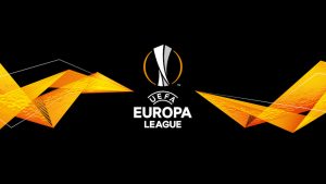
While key elements such as the logo and colours remain, the visual expression has taken on bolder and edgier shapes. The existing ’energy wave‘, visualising the connection between players and fans, has transformed into a linear device that visually underlines the journey of the clubs throughout Europe.
The refined energy wave takes key elements from the UEFA Europa League trophy and brings them to life. It derives from the cup’s triangular, hammered metal sides. The trophy’s angular shape has also led to the structure and movement of the energy wave, expressing the highs and lows of the thrilling adventure clubs and their supporters experience in the UEFA Europa League.
“The refreshed identity is bolder and more daring than before. It will standout more and help us to engage with fans across multiple touch points,” said Guy-Laurent Epstein, Marketing Director, UEFA.
The energy wave has become more expressive. Therefore it supports, together with the core branding assets, better opportunities for UEFA and its partners to own the brand. This will help making the product more recognisable and visually connect to the fans and other stakeholders.
In addition, the refined brand identity has been built to support digital, mobile and social media platforms. The new assets allow for an easier, scalable brand integration (from soft- to full-branding) on smaller surfaces and devices. All motion assets have been produced to cater for ultra-high definition broadcasting requirements.
Greater flexibility
The multiple stakeholder brand usage required a more flexible branding system for the various online, on-air and off-air touch points. The broad range of key visuals allows for more branding variation and flexibility while ensuring consistency of the overall look. The new design system supports photography and footage integration, allowing partners to integrate their identity and therefore create a strong visual association between them and the UEFA Europa League.
“The new identity is dynamic and expresses the UEFA Europa League in an appealing, engaging way,” said Vincenzo Lagattolla, creative director, Sky Italia.
The brand identity featuring the energy wave has been incorporated in the new official match ball of the UEFA Europa League, supplied by Molten. The design expresses the dynamic nature of the competition and the journey of the club throughout Europe.
Finally, a new anthem has been composed to capture the passion and energy of UEFA Europa League match nights. The UEFA Europa League anthem is described as an uplifting and powerful expression that reflects the nature of the competition. It combines modern and classical elements, paying homage to tradition while also looking towards the future.